Dashboard design for 'swimmit' - a smart swimming watch, designated for non professional swimmers with good swimming skills who want to feel like pros
Dashboard
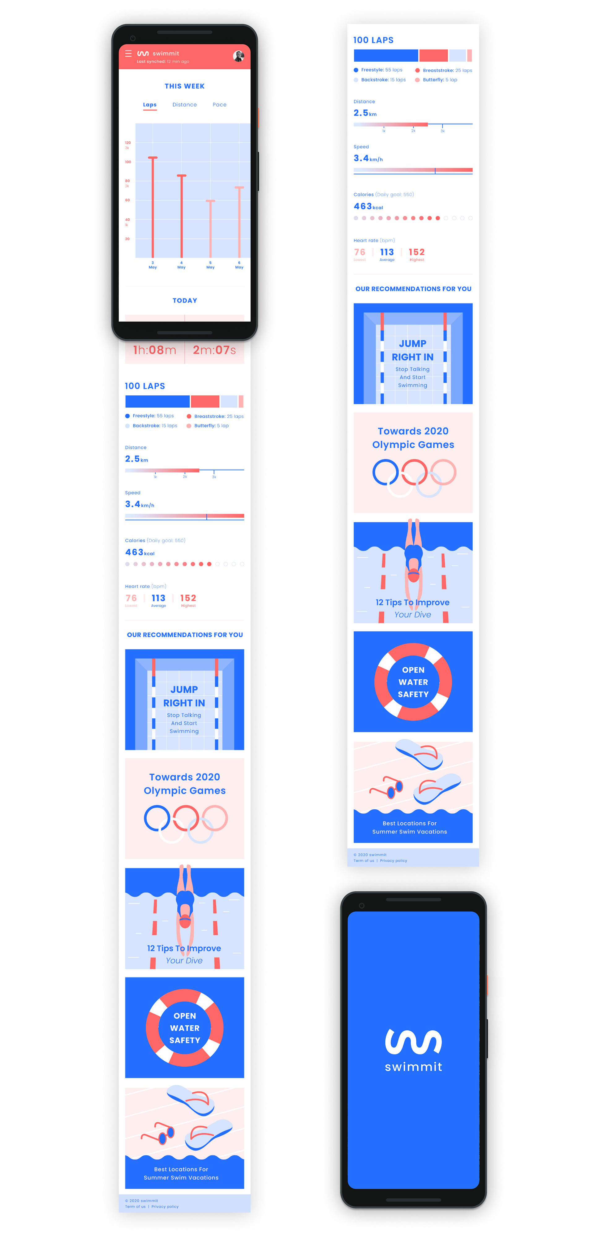
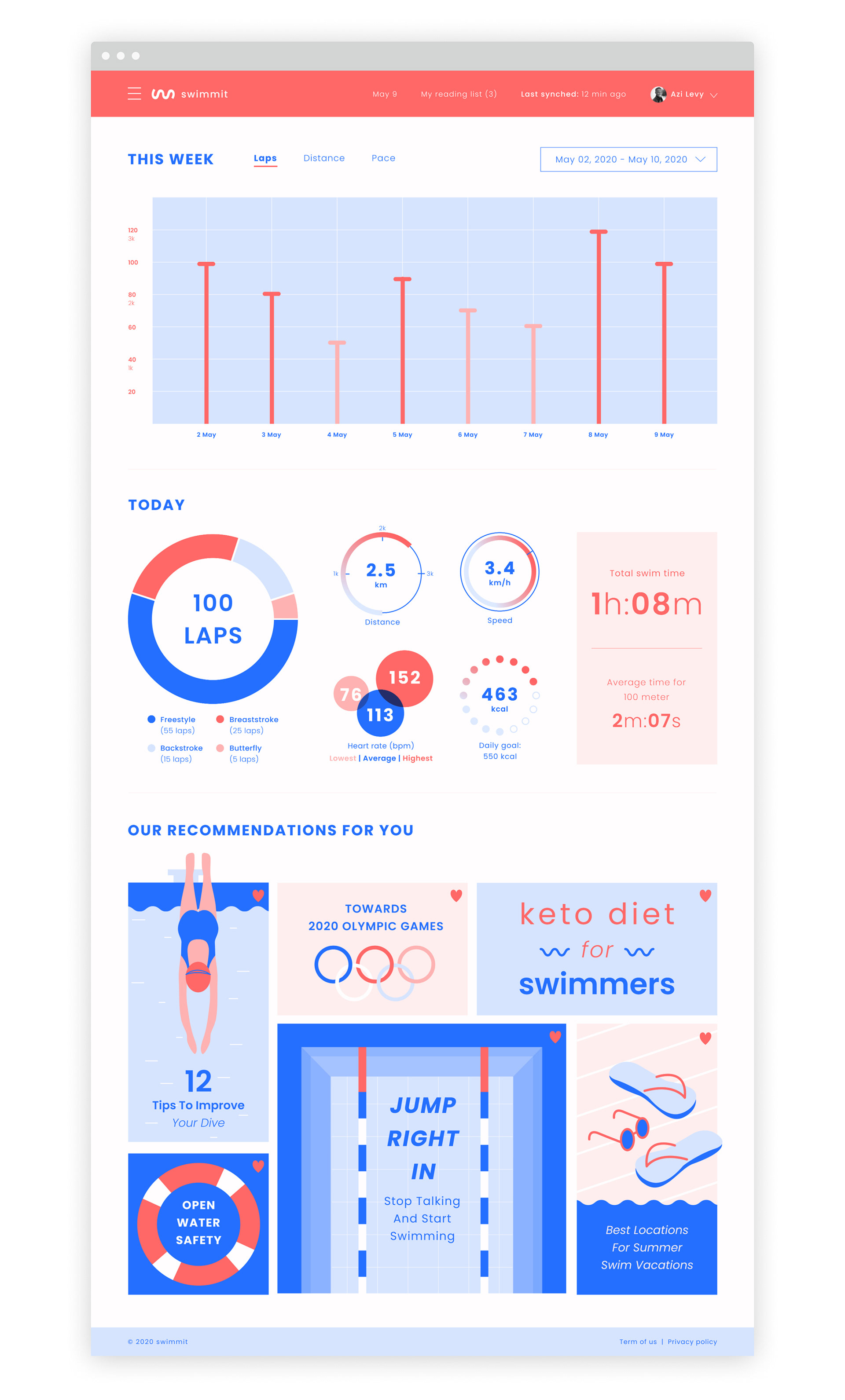
The interface is divided into 3 sections: this week's activity, today's activity and a magazine containing recommendations and arcticles. The design is clean and draws inspiration from the world of sports and swimming. I used classic fonts, fun summery color palette and a white background in order to give the dashboard a light weight accessible look.
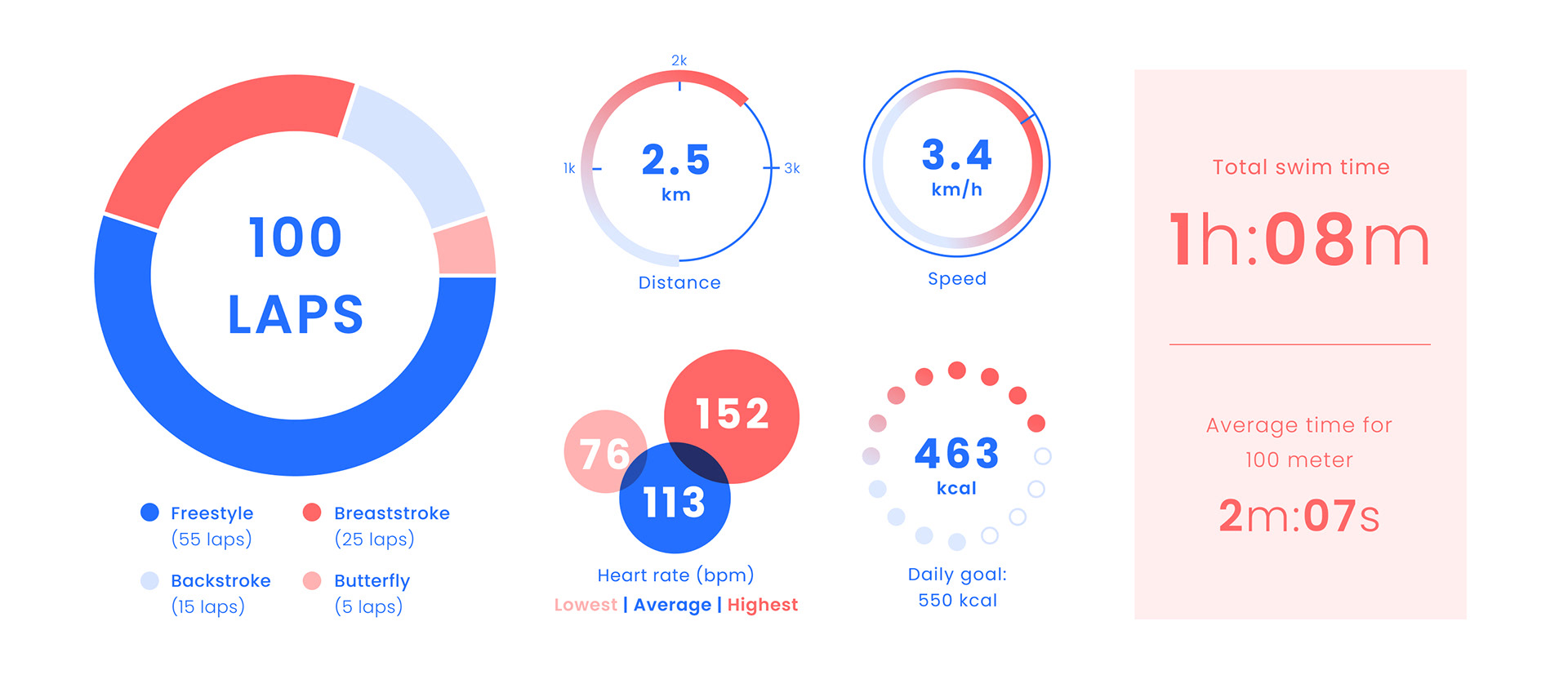
Infographics
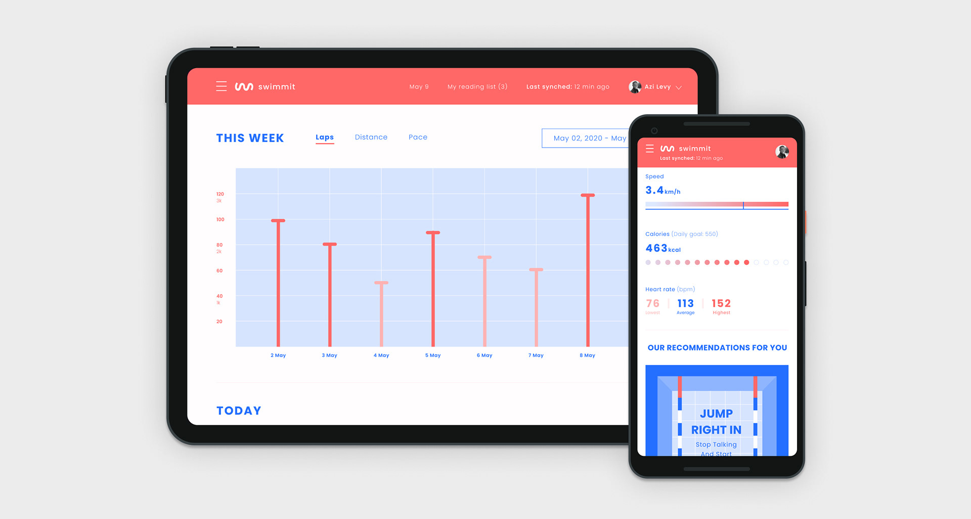
The main graph counts the amount of laps swam in one week. I drew inspiration from the appearance of real swimming pools and created a simple pool and lanes illustration. I wanted the graph to remain clean and informative so in the final design decided to let go of the lane dividers.

The watch monitors and transmits the swimming data in real time. Since each graph monitors different data, The design varies according to the content, remaining in a unified language.
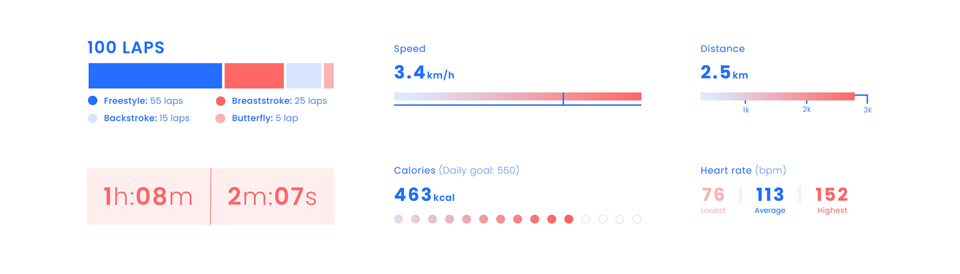
In the mobile version, the graphs are displayed as line graphs in order to be compatible with the mobile format.
Illustrations
The last section of the dashboard is a magazine containing articles and recommendations from the world of swimming, sports and health. I wanted this section to graphically connect to the rest of the dashboard so I designed it using vector illustrations, flat color surfaces and clean typography.

Mobile